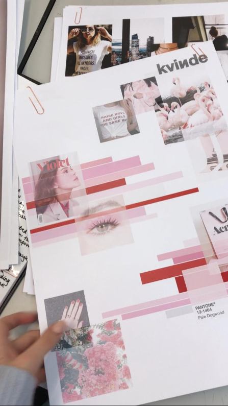
The first of this week’s self-directed days started with finalising my decisions for the font shortlist of logos, and then I moved on to start thinking about colourways for the brand. Colour choice was particularly significant for a brand with this ethos because I knew that to use traditionally female colours would be an interesting take for a retailer which is focused on tearing down many traditional ideas. As I talked about in this daily review of initial branding research, I have been drawn towards imagery that uses the shade of ‘millenial pink’ which has found its way into fashion in recent months. To base a lot of the branding and development around a colour palette like this firstly creates an interesting contrast between traditional and modern ideas to do with feminism, but furthermore it keeps the branding up-to-date as the trend towards this kind of pink spreads through the fashion industry.

This research led me to put together a digital colour board incorporating many different variations of pale pinks, as well as the reds and white that I have also been seeing and which compliment the more delicate shades. The board makes use of photographs as well as blocks of colour to show how the colour choices are linked to real-life and what they might represent, e.g. the bold red lettering seen on a political slogan t-shirt, and the delicate pink used on some packaging from Acne Studios. I think the finished board is successful in pulling together my ideas about how to use colour correctly and with ‘meaning’ and purpose in the development and branding of Kvinde.
Another part of branding research which I carried out in the self-directed days was to look at real-life examples of packaging and include them in my branding sketchbook. I chose the outer boxes from three different cosmetic products, only selecting them based on their use of colours, typography, materials and textures which had multiple links to my ideas about what I wanted to do with packaging for Kvinde. This meant that I wasn’t just taking random pieces of packaging and was properly considering their relevance and how they could inspire me further. After this I looked at packaging which was more appropriate in a fashion context and included different styles of swing tags taken from a number of retailers. Again, only the tags which had aesthetic links to the design themes I had for Kvinde were included and I analysed things such as fonts and the use of texture and eye-catching metallic layers.

